Brand system
A compact identity designed for products, screens and packaging.
MTags has been developed as more than a domain name: it is presented with a clear proposition, identity, product architecture and launch direction.

M
Primary markA distinctive M silhouette with a pet paw built into the symbol.
●
Core paletteDeep navy for trust, clean white for clarity and fresh green for safety.
Aa
TypographyBold geometric sans-serif styling for high legibility across digital and retail.
Included brand-development material
Domain-led brand positioning, logo and identity direction, responsive website, product concepts, use-case architecture, visual brand board and corporate enquiry pathway.
This concept is presented only as part of the complete WebAndNet premium brand portfolio and is not offered separately.
Visual direction
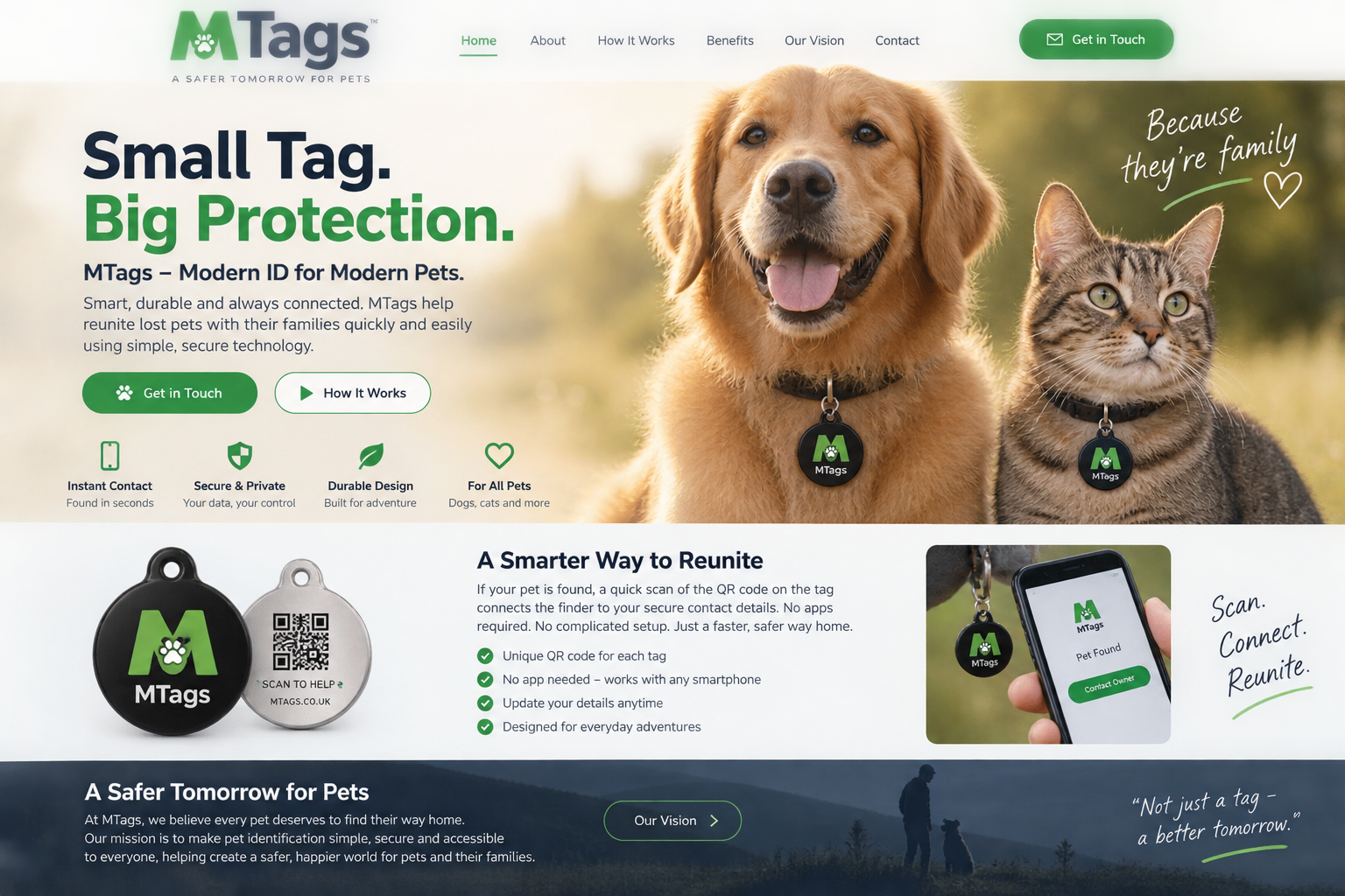
Brand vision in context.
The concept board demonstrates how the identity can extend into product imagery, marketing messages and a consumer-facing web experience.